54 ODD: Deeper into Simpson’s Paradox
This deep dive explores Simpson’s Paradox: a phenomenon where a trend that appears in several groups of data reverses when the groups are combined. It is one of the most striking examples of confounding in action, and understanding it is essential for anyone who works with data. If you take away one thing from the confounding module, let it be this: always ask whether there is a lurking variable that could reverse your conclusions.
54.1 What Is Simpson’s Paradox?
Imagine you are comparing two hospitals. Hospital A has a higher overall survival rate than Hospital B. Sounds like Hospital A is better, right? But when you break the data down by patient severity — mild vs. critical cases — Hospital B actually has a higher survival rate in both categories. How is that possible?
The answer is that Hospital B treats a much higher proportion of critical patients. Their overall rate gets dragged down by a harder caseload, even though they outperform Hospital A within each severity group. The lurking variable — patient severity — reverses the apparent conclusion.
This reversal is called Simpson’s Paradox, named after Edward Simpson who described it in 1951, though the idea was known earlier. It shows up everywhere: in medical studies, in education data, in legal cases, and yes, in psychology research.
54.2 The UC Berkeley Admissions Case
The most famous real-world example comes from UC Berkeley’s graduate admissions in 1973. At first glance, the university appeared to discriminate against women: men had a higher overall admission rate. But when researchers examined each department separately, women were admitted at equal or higher rates in most departments. The paradox arose because women disproportionately applied to more competitive departments.
R has this dataset built in as UCBAdmissions. Let’s explore it.
# UCBAdmissions is a 3-dimensional array; let's convert to a tidy tibble
ucb <- as_tibble(UCBAdmissions)
ucb
#> # A tibble: 24 × 4
#>    Admit    Gender Dept      n
#>    <chr>    <chr>  <chr> <dbl>
#>  1 Admitted Male   A       512
#>  2 Rejected Male   A       313
#>  3 Admitted Female A        89
#>  4 Rejected Female A        19
#>  5 Admitted Male   B       353
#>  6 Rejected Male   B       207
#>  7 Admitted Female B        17
#>  8 Rejected Female B         8
#>  9 Admitted Male   C       120
#> 10 Rejected Male   C       205
#> # ℹ 14 more rows
54.2.1 Overall admission rates by gender
ucb_overall <- ucb %>%
  group_by(Gender, Admit) %>%
  summarise(total = sum(n), .groups = "drop") %>%
  group_by(Gender) %>%
  mutate(prop = total / sum(total)) %>%
  filter(Admit == "Admitted")

ucb_overall
#> # A tibble: 2 × 4
#> # Groups:   Gender [2]
#>   Gender Admit    total  prop
#>   <chr>  <chr>    <dbl> <dbl>
#> 1 Female Admitted   557 0.304
#> 2 Male   Admitted  1198 0.445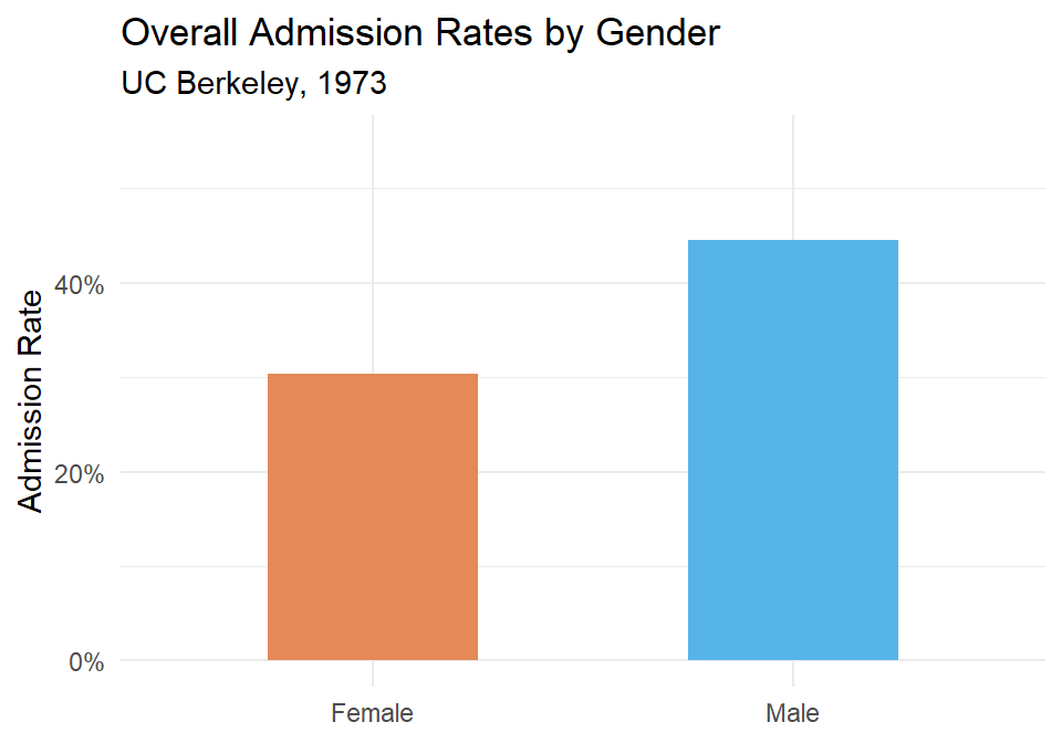
Figure 54.1: Overall admission rates by gender at UC Berkeley, 1973. Men appear to be admitted at a higher rate.
It looks like men are admitted at a noticeably higher rate. But let’s not stop here.
54.2.2 Admission rates by department
ucb_dept <- ucb %>%
  group_by(Dept, Gender, Admit) %>%
  summarise(total = sum(n), .groups = "drop") %>%
  group_by(Dept, Gender) %>%
  mutate(prop = total / sum(total)) %>%
  filter(Admit == "Admitted")

ucb_dept %>% arrange(Dept, Gender) %>%
kable(digits = 3, col.names = c("Department", "Gender", "Admitted", "Total", "Admission Rate"))| Department | Gender | Admitted | Total | Admission Rate |
|---|---|---|---|---|
| A | Female | Admitted | 89 | 0.824 |
| A | Male | Admitted | 512 | 0.621 |
| B | Female | Admitted | 17 | 0.680 |
| B | Male | Admitted | 353 | 0.630 |
| C | Female | Admitted | 202 | 0.341 |
| C | Male | Admitted | 120 | 0.369 |
| D | Female | Admitted | 131 | 0.349 |
| D | Male | Admitted | 138 | 0.331 |
| E | Female | Admitted | 94 | 0.239 |
| E | Male | Admitted | 53 | 0.277 |
| F | Female | Admitted | 24 | 0.070 |
| F | Male | Admitted | 22 | 0.059 |
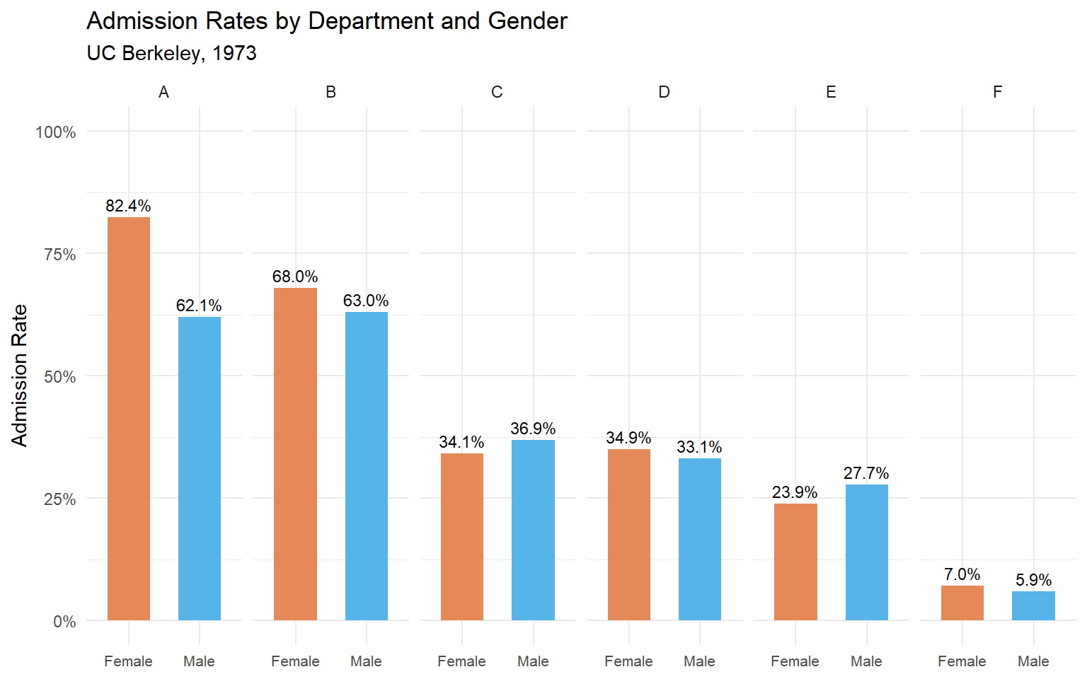
Figure 54.2: Admission rates by department and gender. In most departments, the gender gap disappears or reverses.
Now we can see what’s really going on. In departments A and B, women are actually admitted at higher rates than men. In most other departments, the rates are roughly similar. The overall difference was driven by where people applied, not by who they were.
54.2.3 What explains the reversal?
Women applied in larger numbers to departments with low admission rates (like departments C, D, E, and F), while men applied more heavily to departments with high admission rates (A and B). When you combine the data, the composition effect overwhelms the within-department pattern.
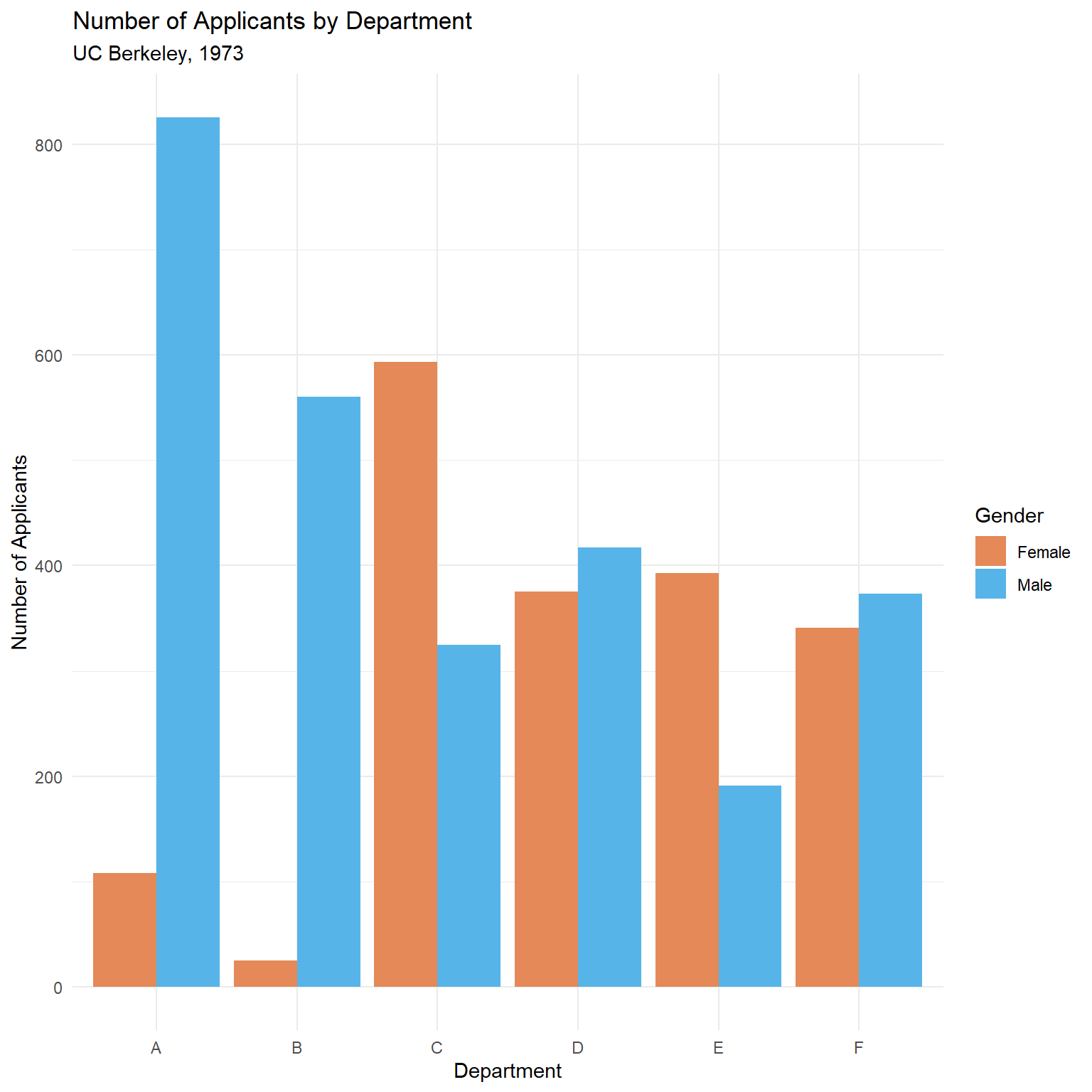
(#fig:simpsons-ucb-applicants_dodge)Number of applicants by department and gender. Women applied disproportionately to more competitive departments.
This is the confound in action: the lurking variable (department choice) is associated with both gender and admission rate.
The weighted average explanation
Why does this reversal happen? The overall admission rate is a weighted average of the department-specific rates, where the weights are the number of applicants. Let’s compute this explicitly:
# Compute department-level stats
ucb_weights <- ucb %>%
  group_by(Dept, Gender) %>%
  summarise(
    admitted = sum(n[Admit == "Admitted"]),
    total = sum(n),
    rate = admitted / total,
    .groups = "drop"
  )

# Show the weighted average calculation for each gender
ucb_weights %>%
  group_by(Gender) %>%
  summarise(
    overall_rate = sum(admitted) / sum(total),
    weighted_avg = sum(rate * total) / sum(total),
    .groups = "drop"
  ) %>%
kable(digits = 3, col.names = c("Gender", "Overall Rate", "Weighted Average"))| Gender | Overall Rate | Weighted Average |
|---|---|---|
| Female | 0.304 | 0.304 |
| Male | 0.445 | 0.445 |
The two columns are identical — the overall rate is the weighted average. The paradox occurs because women’s weights (their application counts) are concentrated on low-admission departments, dragging their weighted average down even though their department-specific rates are comparable or better.
To see this concretely, look at the weights themselves:
| Dept | N (Female) | N (Male) | Rate (Female) | Rate (Male) | % Female Applicants | Rate Diff (F - M) |
|---|---|---|---|---|---|---|
| A | 108 | 825 | 0.824 | 0.621 | 0.116 | 0.203 |
| B | 25 | 560 | 0.680 | 0.630 | 0.043 | 0.050 |
| C | 593 | 325 | 0.341 | 0.369 | 0.646 | -0.029 |
| D | 375 | 417 | 0.349 | 0.331 | 0.473 | 0.018 |
| E | 393 | 191 | 0.239 | 0.277 | 0.673 | -0.038 |
| F | 341 | 373 | 0.070 | 0.059 | 0.478 | 0.011 |
Departments A and B have high admission rates but very few female applicants. Departments C through F have lower admission rates and a much higher share of female applicants. This imbalance in the weights is what drives the paradox.
Formal testing with chi-squared
The visualization strongly suggests that the overall gender gap is an artifact of department composition. We can formalize this with statistical tests.
First, a simple chi-squared test on the aggregated (marginal) table:
# Build the 2x2 marginal table: Gender x Admit
marginal_table <- ucb %>%
  group_by(Gender, Admit) %>%
  summarise(total = sum(n), .groups = "drop") %>%
  pivot_wider(names_from = Admit, values_from = total) %>%
  column_to_rownames("Gender") %>%
  as.matrix()

marginal_table
#>        Admitted Rejected
#> Female      557     1278
#> Male       1198     1493

chisq.test(marginal_table)
#>
#>  Pearson's Chi-squared test with Yates' continuity correction
#>
#> data:  marginal_table
#> X-squared = 92, df = 1, p-value <2e-16
The marginal test is significant — it detects the overall association between gender and admission. But this test ignores department entirely.
Now we use the Cochran–Mantel–Haenszel (CMH) test, which tests for a conditional association between gender and admission after controlling for department:
# UCBAdmissions is already a 3-way array in the right format for mantelhaen.test
mantelhaen.test(UCBAdmissions)
#>
#>  Mantel-Haenszel chi-squared test with continuity correction
#>
#> data:  UCBAdmissions
#> Mantel-Haenszel X-squared = 1, df = 1, p-value = 0.2
#> alternative hypothesis: true common odds ratio is not equal to 1
#> 95 percent confidence interval:
#>  0.772 1.060
#> sample estimates:
#> common odds ratio
#>             0.905
The CMH test is not significant — once we condition on department, there is no evidence of a systematic gender bias. This is the formal statistical test of what the faceted bar charts showed us visually.
Key takeaway: The marginal chi-squared says “there’s a gender effect.” The CMH test says “not after you account for department.” The two tests answer different questions, and Simpson’s Paradox is the reason they disagree.
54.3 A Simulated Example: Treatment Effectiveness
The Berkeley data is compelling, but it can help to see the paradox constructed from scratch. Let’s simulate a medical study where a treatment appears to be less effective overall, but is actually more effective within each patient group.
set.seed(42)

# Mild cases: treatment works well, and most mild patients get the treatment
mild <- tibble(
  severity = "Mild",
  group = c(rep("Treatment", 200), rep("Control", 50)),
  recovered = c(rbinom(200, 1, 0.90), rbinom(50, 1, 0.85))
)

# Severe cases: treatment still works better, but fewer severe patients get it
severe <- tibble(
  severity = "Severe",
  group = c(rep("Treatment", 50), rep("Control", 200)),
  recovered = c(rbinom(50, 1, 0.50), rbinom(200, 1, 0.40))
)

patients <- bind_rows(mild, severe)
54.3.1 Overall recovery rates
| Group | N | Recovered | Recovery Rate |
|---|---|---|---|
| Control | 250 | 111 | 111 |
| Treatment | 250 | 192 | 192 |
The control group has a higher overall recovery rate! Should we conclude that the treatment is harmful?
54.3.2 Recovery rates by severity
| Severity | Group | N | Recovered | Recovery Rate |
|---|---|---|---|---|
| Mild | Control | 50 | 42 | 42 |
| Mild | Treatment | 200 | 174 | 174 |
| Severe | Control | 200 | 69 | 69 |
| Severe | Treatment | 50 | 18 | 18 |
Within both severity groups, the treatment group has a higher recovery rate. The paradox arises because the treatment group contains a disproportionate number of mild patients (who recover at high rates regardless), while the control group is loaded with severe patients.
Decomposing the arithmetic
Let’s trace through the weighted average calculation to see exactly how the reversal works:
sim_decomp <- patients %>%
  group_by(group, severity) %>%
  summarise(
    n = n(),
    rate = mean(recovered),
    .groups = "drop"
  ) %>%
  group_by(group) %>%
  mutate(
    weight = n / sum(n),
    contribution = rate * weight
  )

sim_decomp %>%
  kable(
    digits = 3,
    col.names = c("Group", "Severity", "N", "Recovery Rate",
                   "Weight (proportion)", "Weighted Contribution")
)| Group | Severity | N | Recovery Rate | Weight (proportion) | Weighted Contribution |
|---|---|---|---|---|---|
| Control | Mild | 50 | 0.840 | 0.2 | 0.168 |
| Control | Severe | 200 | 0.345 | 0.8 | 0.276 |
| Treatment | Mild | 200 | 0.870 | 0.8 | 0.696 |
| Treatment | Severe | 50 | 0.360 | 0.2 | 0.072 |
For the Treatment group, 80% of patients are mild (weight = 0.80) and 20% are severe (weight = 0.20). For the Control group, it’s the reverse: 20% mild, 80% severe. The overall rate for each group is the sum of the weighted contributions. Even though Treatment wins in both severity categories, its overall rate is pulled up by a high proportion of “easy” (mild) patients, making the comparison misleading when you ignore severity.
This is the core mechanic: unequal weights on subgroups with different base rates can reverse an association.
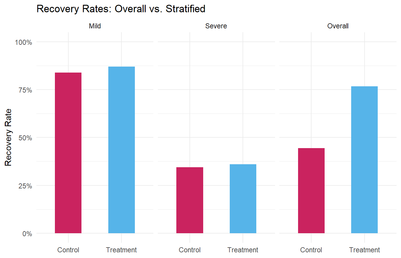
Figure 54.3: Recovery rates by treatment group, overall and stratified by severity. The trend reverses when the lurking variable is accounted for.
54.4 Visualizing the Paradox with Scatter Plots
Simpson’s Paradox isn’t limited to proportions. It can also appear in continuous data, where the direction of a correlation reverses when you account for a grouping variable.
set.seed(123)

# Three groups with positive within-group slopes but negative overall slope
continuous_example <- bind_rows(
  tibble(
    group = "A",
    x = rnorm(50, mean = 2, sd = 0.8),
    y = 0.8 * x + rnorm(50, mean = 8, sd = 0.5)
  ),
  tibble(
    group = "B",
    x = rnorm(50, mean = 5, sd = 0.8),
    y = 0.8 * x + rnorm(50, mean = 4, sd = 0.5)
  ),
  tibble(
    group = "C",
    x = rnorm(50, mean = 8, sd = 0.8),
    y = 0.8 * x + rnorm(50, mean = 0, sd = 0.5)
  )
)
#> `geom_smooth()` using formula = 'y ~ x'
#> `geom_smooth()` using formula = 'y ~ x'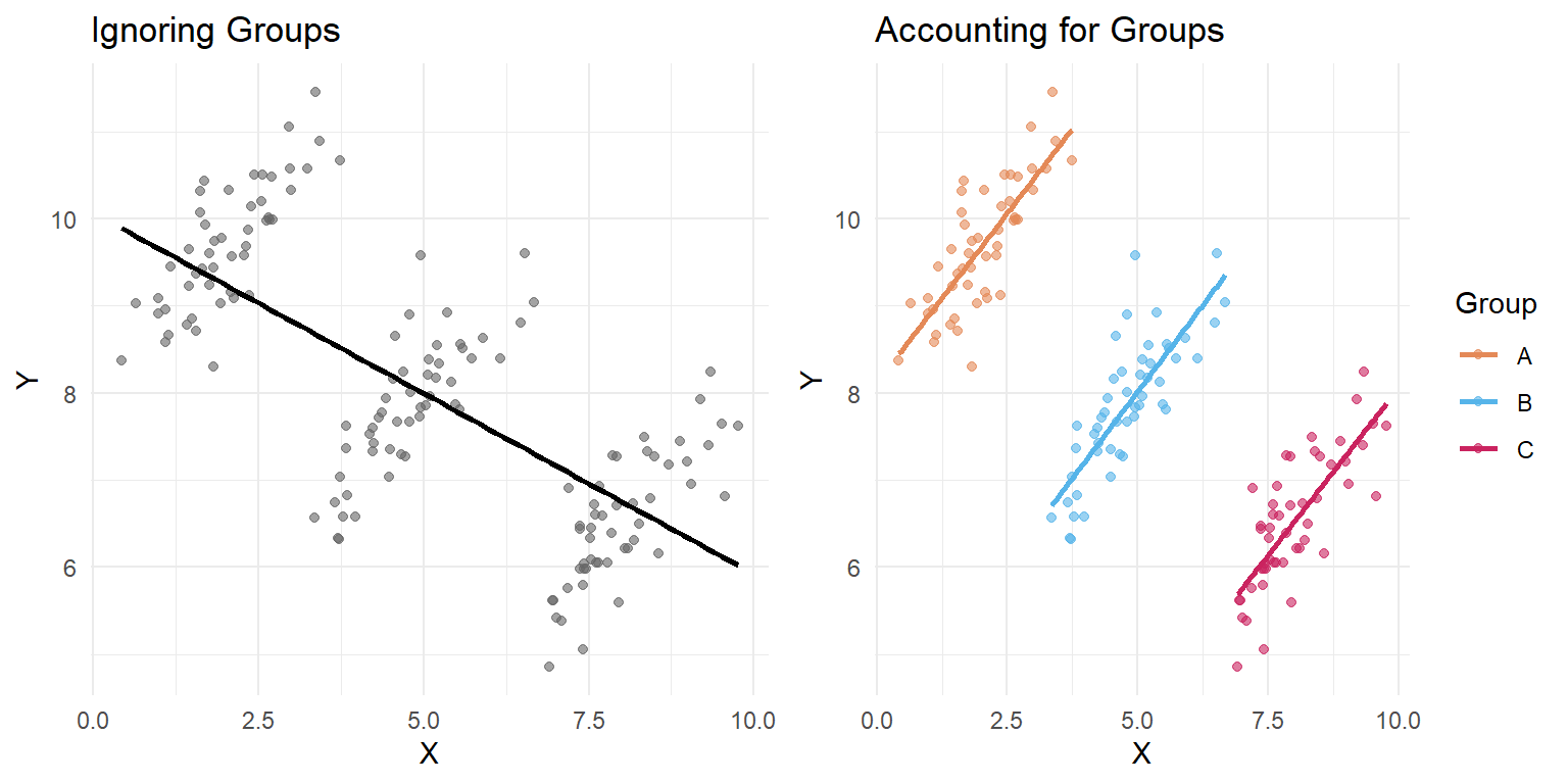
Figure 54.4: Simpson’s Paradox with continuous data. The overall trend (left) is negative, but the within-group trends (right) are all positive.
In the left panel, the overall trend line slopes downward. In the right panel, every group’s trend line slopes upward. The negative overall slope is entirely an artifact of the group structure.
Quantifying the sign flip with regression
The plots make the reversal obvious, but let’s put numbers on it. We’ll fit two linear models: one that ignores group membership, and one that includes it as a covariate.
# Model 1: Ignore groups
model_overall <- lm(y ~ x, data = continuous_example)

# Model 2: Include group as a covariate
model_grouped <- lm(y ~ x + group, data = continuous_example)| Model | Slope of x | p-value |
|---|---|---|
| Ignoring groups (y ~ x) | -0.414 | 0 |
| Controlling for group (y ~ x + group) | 0.781 | 0 |
The slope of x is negative when we ignore groups, but positive (and closer to the true generating value of 0.8) when we control for group. This is the regression equivalent of what we saw in the plots. Adding the grouping variable to the model “adjusts” for the confound, revealing the true within-group relationship.
You can also see the full model summaries:
# Full summary of the grouped model
tidy_overall <- broom::tidy(model_overall) %>%
  mutate(model = "Ignoring groups")
tidy_grouped <- broom::tidy(model_grouped) %>%
  mutate(model = "Controlling for group")

bind_rows(tidy_overall, tidy_grouped) %>%
  select(model, term, estimate, std.error, p.value) %>%
kable(digits = 4, col.names = c("Model", "Term", "Estimate", "Std. Error", "p-value"))| Model | Term | Estimate | Std. Error | p-value |
|---|---|---|---|---|
| Ignoring groups | (Intercept) | 10.071 | 0.1908 | 0 |
| Ignoring groups | x | -0.414 | 0.0343 | 0 |
| Controlling for group | (Intercept) | 8.112 | 0.1212 | 0 |
| Controlling for group | x | 0.781 | 0.0502 | 0 |
| Controlling for group | groupB | -4.001 | 0.1673 | 0 |
| Controlling for group | groupC | -7.835 | 0.3136 | 0 |
Notice that in the grouped model, the groupB and groupC coefficients are large and negative — these capture the different intercepts (mean levels) for each group, which is exactly the structure that created the paradox.
54.5 The Causal Structure: A Brief Look at DAGs
Judea Pearl (who is listed in the module’s suggested readings) formalized why Simpson’s Paradox occurs using directed acyclic graphs (DAGs) — diagrams that represent causal relationships between variables.
In the Berkeley admissions example, the causal structure looks roughly like this:
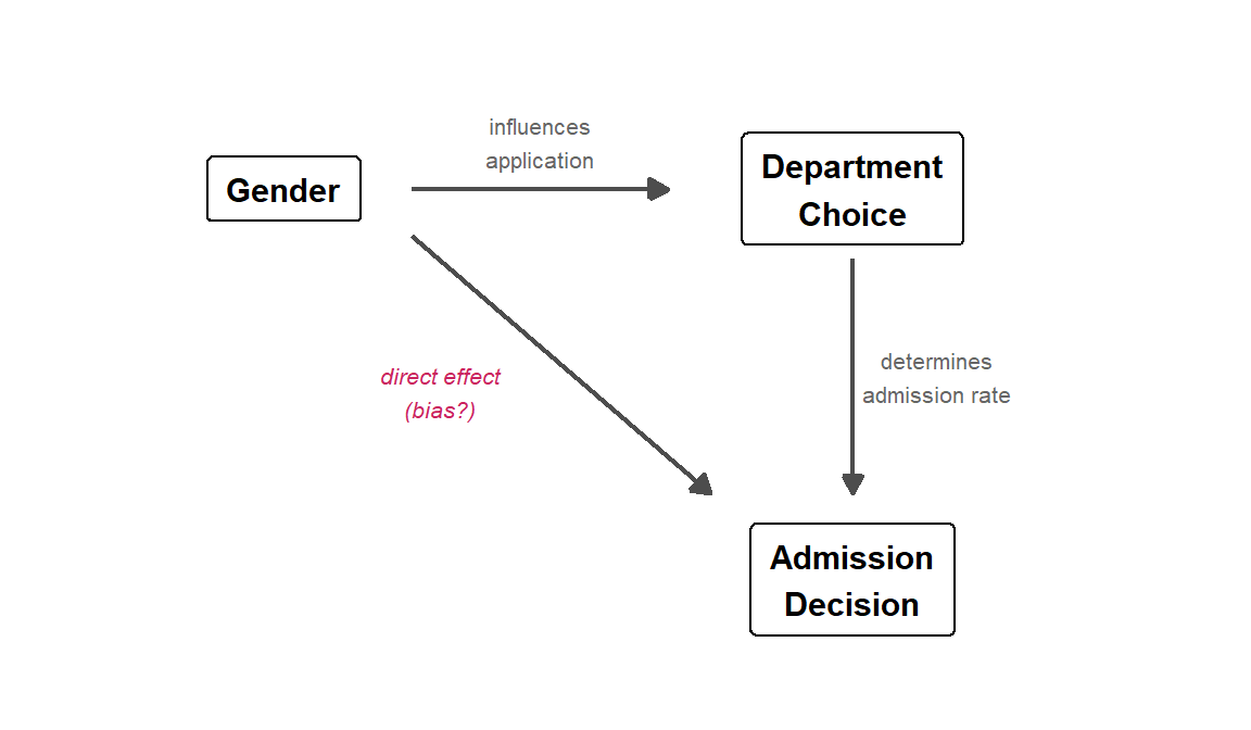
Figure 54.5: A directed acyclic graph (DAG) for the Berkeley admissions example. Department is a mediator on the path from Gender to Admission, and also a confounder of the marginal Gender–Admission association.
Gender influences which department a student applies to (some departments attracted more men or women). Department choice, in turn, strongly influences admission (some departments are far more competitive). The direct arrow from Gender to Admission represents any actual gender bias in the process — the question mark is the whole point of the analysis.
The paradox arises because Department is a confounding variable — it sits on a path between Gender and Admission. When we look at the marginal (overall) data, we are mixing together two effects: any direct gender effect and the indirect path through department choice. When we condition on Department (by looking within departments), we block the indirect path and isolate the direct effect.
The DAG tells us which variable to condition on. This is not always obvious:
- Confounders (common causes of both the predictor and the outcome) should generally be conditioned on — this is what we did with Department.
- Colliders (variables caused by both the predictor and the outcome) should generally not be conditioned on, because doing so can create a spurious association. This is a more advanced topic, but it’s worth knowing that “always control for everything” is not the right strategy.
For a thorough treatment, see Pearl’s paper linked in the Further Reading section. The key insight for our purposes: you need a causal model (even an informal one) to know whether aggregating or stratifying gives the right answer.
54.6 Why This Matters for Psychology
Simpson’s Paradox is not just a statistical curiosity — it has real consequences for research conclusions. Here are a few scenarios where psychologists should be especially vigilant:
Treatment effectiveness studies: A therapy that works well for both mild and severe cases can appear ineffective overall if it is disproportionately used for severe cases (as in our simulation above).
Educational interventions: A teaching method might improve outcomes for both high- and low-performing students, but if it’s primarily adopted by schools with low-performing students, the aggregate data could suggest the method is harmful.
Cross-cultural comparisons: A relationship between two variables might hold within every culture studied, but reverse when cultures are pooled together, because cultures differ on a third variable.
Longitudinal data: Trends over time within individuals can look very different from trends across individuals at a single time point (an instance of the ecological fallacy, which is closely related).
The general lesson: aggregated data can mask or reverse relationships that exist at a finer level of analysis. Whenever you see a surprising pattern in grouped data, ask yourself what happens when you break the data down further.
54.7 How to Protect Yourself
Here are some practical strategies for avoiding Simpson’s Paradox:
Think about confounds before analyzing. What variables might be associated with both your predictor and your outcome? This is the same logic behind experimental design and statistical control.
Stratify or condition on potential confounders. Look at your data broken down by relevant subgroups before drawing conclusions from aggregated numbers.
Visualize at multiple levels. Make plots that show both the overall pattern and the within-group patterns. Side-by-side comparisons (like the faceted plots above) make reversals immediately obvious.
Be skeptical of aggregate statistics. When someone reports an overall rate or trend, always ask: “Overall for whom? Compared to what? Broken down by what?”
Use regression with appropriate controls. Including confounding variables in a regression model is a formal way to “adjust” for them. We saw this with the continuous example above: the slope of
xflipped sign when we addedgroupto the model. For the Berkeley data, you could fit a logistic regression:
# Logistic regression: does gender predict admission after controlling for department?
ucb_long <- ucb %>%
  uncount(n) # expand counts into individual rows

# Without department
glm_marginal <- glm(
  (Admit == "Admitted") ~ Gender,
  data = ucb_long, family = binomial
)

# With department
glm_controlled <- glm(
  (Admit == "Admitted") ~ Gender + Dept,
  data = ucb_long, family = binomial
)

# Compare the Gender coefficient
tibble(
  Model = c("Gender only", "Gender + Department"),
  `Gender (Male) coefficient` = c(coef(glm_marginal)["GenderMale"],
                                   coef(glm_controlled)["GenderMale"]),
  `Odds Ratio` = exp(c(coef(glm_marginal)["GenderMale"],
                        coef(glm_controlled)["GenderMale"]))
) %>%
kable(digits = 3)| Model | Gender (Male) coefficient | Odds Ratio |
|---|---|---|
| Gender only | 0.61 | 1.841 |
| Gender + Department | -0.10 | 0.905 |
Without department, the coefficient for GenderMale is positive (men have higher odds of admission). With department included, it shrinks substantially or becomes negative — men no longer have an advantage, and may even have a slight disadvantage. This is the logistic regression analog of the CMH test we ran earlier.
54.8 Common Pitfalls
Assuming the aggregated result is always wrong. Simpson’s Paradox doesn’t tell you which level of analysis is “correct” — that depends on the research question. Sometimes the overall rate is what matters; sometimes the within-group rate is more informative. You need subject-matter knowledge to decide.
Over-stratifying. If you break data into too many subgroups, you can end up with tiny samples and unreliable estimates. There’s a balance between controlling for confounds and maintaining statistical power.
Ignoring the paradox entirely. Many published studies report only aggregate results. If the data could plausibly be confounded by a grouping variable, the aggregate result could be misleading.
54.9 Further Reading
- Judea Pearl, Understanding Simpson’s Paradox — the reading from the module materials, a classic treatment of the paradox from a causal inference perspective
- Wikipedia: Simpson’s Paradox — thorough overview with many real-world examples
- Bickel, P. J., Hammel, E. A., & O’Connell, J. W. (1975). Sex bias in graduate admissions: Data from Berkeley. Science, 187(4175), 398–404 (PDF) — the original Berkeley admissions paper
- Kievit, R. A., Frankenhuis, W. E., Waldorp, L. J., & Borsboom, D. (2013). Simpson’s paradox in psychological science: A practical guide. Frontiers in Psychology, 4, 513 — directly relevant to psychology research