56 LAB: Ugly charts and Simpson’s paradox
The two data visualized embedded in this lab violate many data visualization best practices. Improve these visualizations using R and the tips for effective visualizations that we’ve introduced. You should produce one visualization per dataset. Your visualization should be accompanied by a brief paragraph describing the choices you made in your improvement, specifically discussing what you didn’t like in the original plots and why, and how you addressed them in the visualization you created.
The learning goals for this lab are:
- Telling a story with data
- Data visualization best practices
- Reshaping data
Getting started
Go to the course GitHub organization and locate your lab repo. Either Fork it or copy it as a template. Then clone it in RStudio. Refer to Lab 01 if you would like to see step-by-step instructions for cloning a repo into an RStudio project.
First, open the R Markdown document and Knit it. Make sure it compiles without errors. (Also, remember to check the final version after you upload!)
The output will be in the file markdown .md file with the same name.
Housekeeping
Remember: Your email address is the address tied to your GitHub account and your name should be first and last name.
Before we can get started we need to take care of some required housekeeping. Specifically, we need to do some configuration so that RStudio can communicate with GitHub. This requires two pieces of information: your email address and your name.
Run the following (but update it for your name and email!) in the Console to configure git:
Take a sad plot and make it better
Instructional staff employment trends
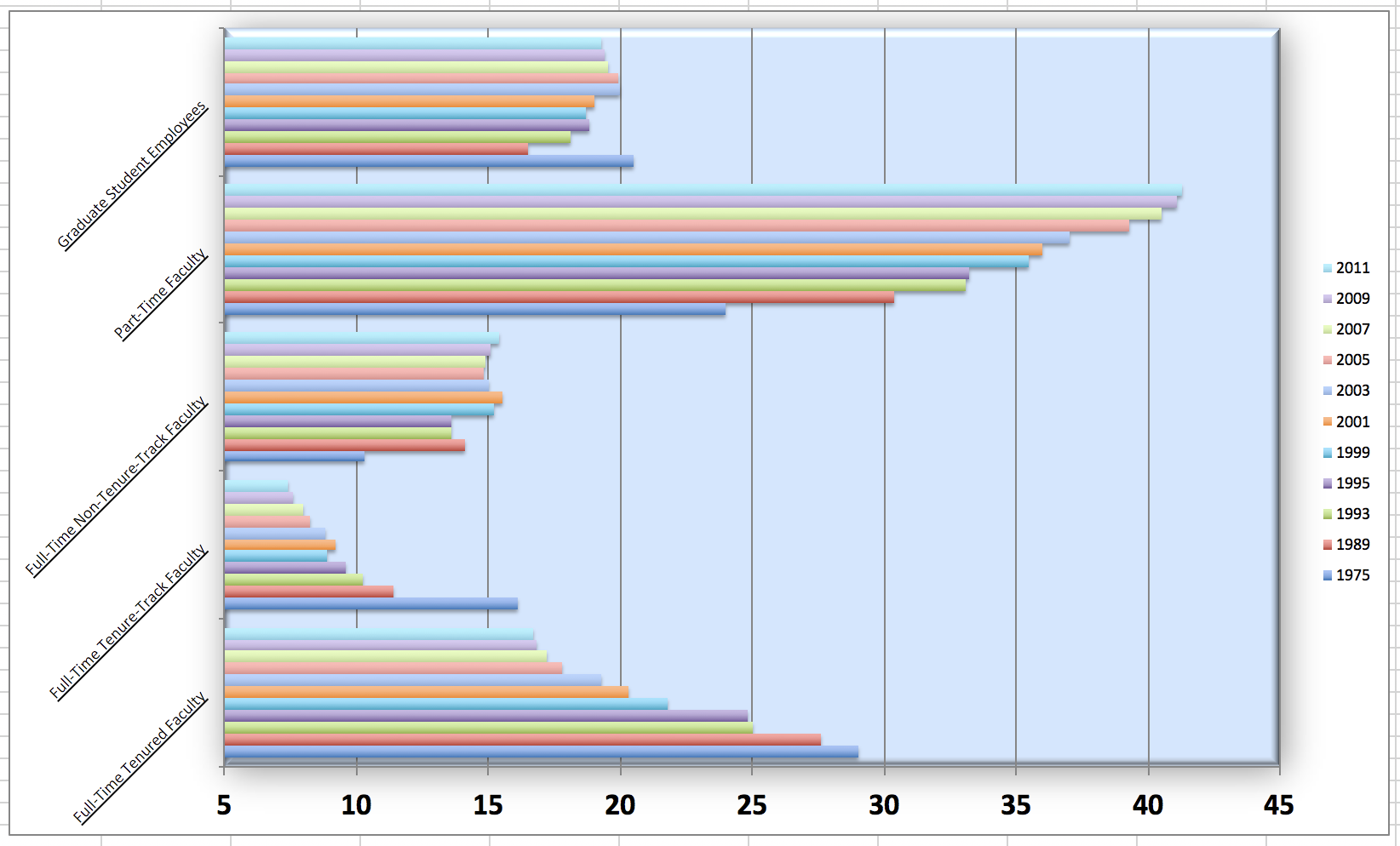
The American Association of University Professors (AAUP) is a nonprofit membership association of faculty and other academic professionals. This report compiled by the AAUP shows trends in instructional staff employees between 1975 and 2011, and contains an image very similar to the one given below.
Let’s start by loading the data used to create this plot.
Each row in this dataset represents a faculty type, and the columns are the years for which we have data. The values are percentage of hires of that type of faculty for each year.
## # A tibble: 5 × 12
##   faculty_type    `1975` `1989` `1993` `1995` `1999` `2001` `2003` `2005` `2007`
##   <chr>            <dbl>  <dbl>  <dbl>  <dbl>  <dbl>  <dbl>  <dbl>  <dbl>  <dbl>
## 1 Full-Time Tenu…   29     27.6   25     24.8   21.8   20.3   19.3   17.8   17.2
## 2 Full-Time Tenu…   16.1   11.4   10.2    9.6    8.9    9.2    8.8    8.2    8
## 3 Full-Time Non-…   10.3   14.1   13.6   13.6   15.2   15.5   15     14.8   14.9
## 4 Part-Time Facu…   24     30.4   33.1   33.2   35.5   36     37     39.3   40.5
## 5 Graduate Stude…   20.5   16.5   18.1   18.8   18.7   19     20     19.9   19.5
## # ℹ 2 more variables: `2009` <dbl>, `2011` <dbl>
To recreate this visualization, we must first reshape the data by separating it into two variables: one for faculty type and one for year. In other words, we will be converting our data from wide format to long format.
However, before we do so, consider this thought exercise: How many rows will the long-format data have? Each combination of year and faculty type will have its own row. If there are 5 faculty types and 11 years of data, how many rows would we have?
We can perform the conversion from wide to long format using a new function: pivot_longer(). The animation below demonstrates how this function works, as well as its counterpart pivot_wider().
The function has the following arguments:
- The first argument is
dataas usual. - The second argument,
cols, is where you specify which columns to pivot into longer format – in this case all columns except for thefaculty_type - The third argument,
names_to, is a string specifying the name of the column to create from the data stored in the column names of data – in this caseyear
staff_long <- staff %>%
  pivot_longer(cols = -faculty_type, names_to = "year") %>%
  mutate(value = as.numeric(value))
Let’s take a look at what the new longer data frame looks like.
## # A tibble: 6 × 3
##   faculty_type              year  value
##   <chr>                     <chr> <dbl>
## 1 Full-Time Tenured Faculty 1975   29
## 2 Full-Time Tenured Faculty 1989   27.6
## 3 Full-Time Tenured Faculty 1993   25
## 4 Full-Time Tenured Faculty 1995   24.8
## 5 Full-Time Tenured Faculty 1999   21.8
## 6 Full-Time Tenured Faculty 2001   20.3
And now, let’s plot it as a line graph. A possible approach for creating a line plot and differentiating the lines by faculty type is to use the following method:
## `geom_line()`: Each group consists of only one observation.
## ℹ Do you need to adjust the group aesthetic?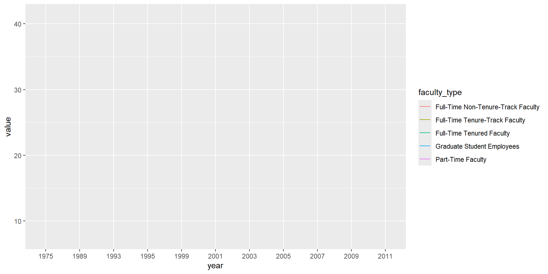
But note that this code results in a message, as well as an unexpected plot. The message informs us that there is only one observation for each faculty type and year combination. To address this, we can use the group aesthetic in the following code.
staff_long %>%
  ggplot(aes(
    x = year,
    y = value,
    group = faculty_type,
    color = faculty_type
  )) +
  geom_line()
Include the line plot you made above in your report and make sure the figure width is large enough to make it legible. Also fix the title, axis labels, and legend label.
Suppose the objective of this plot was to show that the proportion of part-time faculty have gone up over time compared to other instructional staff types. What changes would you propose making to this plot to tell this story? Implement the changes you think would be most effective, and include the new plot in your report. Document the changes you made and why you made them in a brief paragraph.
⬆️ Commit and push your changes to GitHub with an appropriate commit message. Make sure to commit and push all changed files so that your Git pane is cleared up afterwards.
Fisheries
The Fisheries and Aquaculture Department of the Food and Agriculture Organization of the United Nations (FAO) collects data on the fisheries production of different countries. You can find a list of fishery production for various countries in 2016 on this Wikipedia page. The data includes the tonnage of fish captured and farmed for each country. Note that countries whose total harvest was less than 100,000 tons are excluded from the visualization.
A researcher has shared a visualization they created using these data with you.
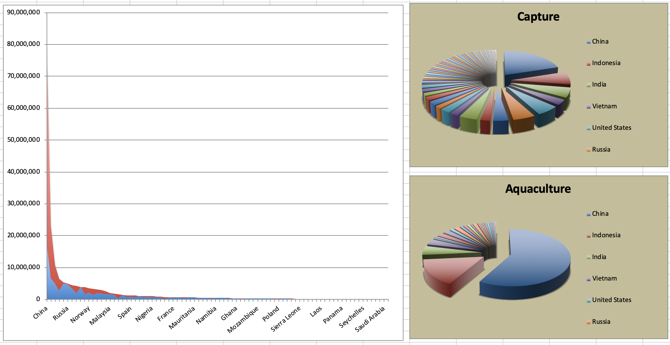
- Can you help them improve it?
- 3.1. First, brainstorm how you would improve it.
- 3.2. Then create the improved visualization and document your changes/decisions with bullet points. It’s ok if some of your improvements are aspirational, i.e. you don’t know how to implement it, but you think it’s a good idea. Implement what you can and leave notes identifying the aspirational improvements that could not be made. (You don’t need to recreate their plots in order to improve them)
✅ ⬆️ Commit and push your changes to GitHub with an appropriate commit message again. Make sure to commit and push all changed files so that your Git pane is cleared up afterwards.
Stretch Yourself with Smokers in Whickham
If you still have some time left (or are a graduate student), move on to the remaining exercises below. These are optional stretch goals. They are designed to challenge you and hone your skills.

A study conducted in Whickham, England recorded participants’ age and smoking status at baseline, and then 20 years later, their health outcome was recorded.
Packages
Now, we will work with the mosaicData package.
Because this is first time we’re using the mosaicData package, you need to make sure to install it first by running install.packages("mosaicData") in the console.
Note that these packages are also loaded in your R Markdown document.
The data
The data is in the mosaicData package. You can load it with
Take a peek at the codebook with
Exercises
What type of study do you think these data come from: observational or experiment? Why?
How many observations are in this dataset? What does each observation represent?
How many variables are in this dataset? What type of variable is each? Display each variable using an appropriate visualization.
What would you expect the relationship between smoking status and health outcome to be?
Create a visualization depicting the relationship between smoking status and health outcome. Briefly describe the relationship, and evaluate whether this meets your expectations. Additionally, calculate the relevant conditional probabilities to help your narrative. Here is some code to get you started:
- Create a new variable called
age_catusing the following scheme:
age <= 44 ~ "18-44"age > 44 & age <= 64 ~ "45-64"age > 64 ~ "65+"
- Re-create the visualization depicting the relationship between smoking status and health outcome, faceted by
age_cat. What changed? What might explain this change?
Extend the contingency table from earlier by breaking it down by age category and use it to help your narrative. We can use the contingency table to examine how the relationship between smoking status and health outcome differs between different age groups. This extension will help us better understand the patterns we see in the visualization, and explain any changes we observe.
If you want to learn more about this data set, you can read the original paper describing the phenomenon: Appleton et al. 1996. This paper is published in the American Statistician.
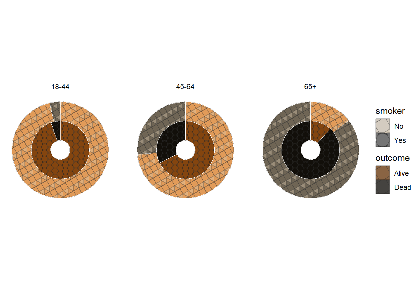
56.0.1 Challenge Graph
- Recreate the following plot, and interpret what you see in context of the data.
Click to for hints about the library
Hint: You will need to use the ggpattern package to create the pattern fill. The documentation for the package is available here.
Wrapping up
If you want to learn more about this data set, you can check out the following resources: appleton1996ignoring
Go back through your write up to make sure you’re following coding style guidelines we discussed in class. Make any edits as needed.
Also, make sure all of your R chunks are properly labeled, and your figures are reasonably sized.
🧶 ✅ ⬆️ Knit, commit, and push your changes to GitHub with an appropriate commit message. Make sure to commit and push all changed files so that your Git pane is cleared up afterwards and review the md document on GitHub to make sure you’re happy with the final state of your work.